Simple is probably best, as the Crowd DNA value goes. But let’s listen to that ‘probably’ for a moment, as Freddie Mason takes a look at when ‘complicated’ could be what we’re after…
Simplicity To The Point Of Invisibility
It’s often assumed that the hallmarks of great design (whether it be UX or product) are seamlessness and simplicity to the point of invisibility. As is often said of cinema editors, the really great designer is one that all but disappears, connecting you to your goal, story or information as if by magic.
But there are certain things that this seamlessness lacks. For users there are times when a snag, a complication, a bit of friction not only gives them something to remember, but also a chance to reflect on what they’re actually doing. Complications can even be, dare I say it, pleasurable.
In the era of the doom scroll, the odd bit of blockage goes a long way.
The Anti-Design Aesthetic
This graphic design aesthetic for the Dutch design studio Studio Push is known as anti-design:
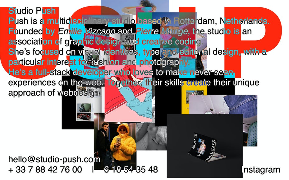
At first it feels like a scramble of text and image. The experience of reading is far from seamless. In fact, it feels unreadable, full of snags. But then you realise it isn’t. And as you start to read, you dive into each image as the text bounces through textures. The design asks you to stay a little longer, to pay more attention, and you’ll be rewarded. The effect of the design’s complicated, noisy aesthetic is a heightened engagement with the interface. And as a result, you’re more likely to remember it.
This draws our attention, then, to something frictionless, seamless design lacks – memorability. Complicated-ness resists the infinite, infinitely forgettable, homogeneity of cookie cutter websites.
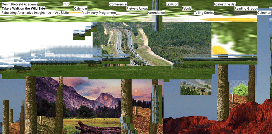
Anti-design webpages can draw you in through their mystery and disorientation, as is the case with a glitch aesthetic site design like Studium Generale’s Take A Walk On The Wild Side. Simple mouse motions bring the chaotic glitching into coherence and clarity, as the user learns the secret rules of the page. It’s a discovery. It’s exciting.
Anti-design sites are also super original, and allow for a greater sense of brand identity to translate to the visitor.
A Marie Kondo Kick Back
It’s no doubt that anti-design aesthetics in digital design are trendy right now, as a reaction against the dominance of slick, minimal sites that may work very, very well, but fail to challenge or surprise. It’s a trend that is reflected, too, in the joys of maximalism in domestic interiors. While we’ve seen Marie Kondo’s rigorous decluttering find immense appeal, counter trends that indulge in sheer visual cacophony are also in full swing. As with all parts of life, it sometimes feels these days, it’s the moderate middle ground that can be seen gasping for cultural air time.

Positive Friction
Coming back to UX design, we can see how carefully curated complicated-ness introduces frictions that result in a whole range of positives for users. In very practical instances, interfaces introducing elements that ‘get in the way’ can save us from, for example, making unwanted money transfers by mistake or forgetting to attach documents to an email. While these might not be the most thrilling things digital tech has to offer, it’s all part of a more mindful and reflective approach to tech that increased friction encourages.
Or, we can look to the way the ‘pages’ of ebooks pause momentarily when ‘turned’, mimicking that split second of contemplation afforded by their physical counterparts. Ebooks could, of course, transition between pages seamlessly, but this, in fact, would make their content or story line harder to absorb for readers. This is in line with the discoveries made by a study conducted way back in 2010, which showed that information expressed in harder to read fonts was more memorable. ‘Disfluency’ is the term used to describe the struggle associated with a difficult mental task. And it is disfluency, rather than fluency, in our interfaces that helps us learn.
Deep Satisfaction
Ultimately, though, friction, not endless flow, is what so often gives us a deeper sense of satisfaction. The contemplative moment of turning a page, that tactile pause, is fundamental to the joy of reading a book. It is the absence of such a moment when scrolling through the heterogenous matter of social media feeds that can summon doom.
IRL, designers have been experimenting with this sort of thing for years, and with great success. Legend has it that instant cake mix packs didn’t sell until buyers were required to provide their own eggs. People needed that extra step to feel they’d made the cake. And IKEA realised many moons ago that people assembling their own furniture not only made shipping easier, but their customers happier, feeling more involved.

All this helps us to remember that a world of perfectly engineered convenience (if such a thing were even possible) would bore us to tears. I have a friend who loves to cut his facial hair with scissors, rather than an electric beard trimmer, because he enjoys the sound, and will go so far as to get up early in order to partake in this considerably trickier and time-consuming self care routine.
If I can, I will always take the bus in London (even at rush hour) rather than the tube, just to get that visceral feeling of the city. Or, it’s Edward Tenner’s (author of The Efficiency Paradox) decision to hand grind his coffee in the morning, because there is a “slowness and deliberateness to the task that is intrinsically satisfying.”
And most recently – Netflix are planning on making people wait for episodes of their favourite shows, slowing down the binge-till-infinity trend that’s recently dominated.
Mental Health
It’s fair to say that all this sits right at the core of improved mental health. And apps in the business of helping people with this are also experimenting with positive friction. The new app imi, for example, is there to guide LGBTQ+ teens through their mental health. The app’s content can be ‘extremely heavy at times’. As a result, the guide is carefully paced, with buffers strategically placed for users to log off and reflect. This isn’t a scroll-through, ‘two min read’ thing. And thank god it’s not.
Here’s to blockages. Long may they be there for us to overcome.